|
|
 I.
Introduction I.
Introduction
II.
Mies van der Rohe and the Creation
of a New Architecture on the IIT campus
III.
About Rem Koolhaas
IV.
Rem Koolhaas's IIT McCormick
Tribune Campus Center
V. An Interview
with Rem
Koolhaas
In
his essay “Miestakes,”Koolhaas
describes the current IIT campus as marooned...swimming in space.”
It had been “scraped” clean of its urban 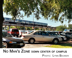 density,
he says, and a long period of decay had resulted in the “disappearance of the city around it.” Now “it is no longer
a void in an urban condition, but it is a void in a void.” And within the campus
was still another void, where the Green Line and a long strip of surface parking lots cut the dorms to the east off from the classrooms to the west. density,
he says, and a long period of decay had resulted in the “disappearance of the city around it.” Now “it is no longer
a void in an urban condition, but it is a void in a void.” And within the campus
was still another void, where the Green Line and a long strip of surface parking lots cut the dorms to the east off from the classrooms to the west.
Koolhaas - whose blue-chip roster of participants in the Campus Center
project includes the Chicago firms Studio/Gang/Architects
and Holabird & Root,
as well as international powerhouse Ove
Arup - rejected the competition's requirement that the different functions
of the Campus Center be stacked in a multistory building to muffle the
noise from the “L.” He opted instead to "make a very flat
building" in which the different elements-sports bar, bookstore,
post office, cafe-would continually rub up against one another, creating
new hybrid activities and a “simulation” of the dynamics of
the urban condition. The “culture of congestion” in a single
building.
For two days in 1997 Koolhaas used a team of students to track movement across the campus through the project site. They came up with a web of heavily traveled paths, which Koolhaas turned into walkways through the building that divide it into a “series of islands,” each with its own function and visual character.
He also had to address the problem of the “L” and what he called
the "acoustic disaster zone" it created down the center of campus.
The roar of the trains hit 110 decibels there-the pain threshold is 85. The project manager, Ed Newman, jokes that the standard IIT greeting was “to
put both hands over your ears and yell 'Hi' as loudly as you can.”
In their proposal Jahn and his associates had come up with the relatively inexpensive idea of laminating rubber blocks and strips along the flanges of the tracks, which their research showed would significantly decrease
the noise (something the city ought to consider trying out in the Loop).
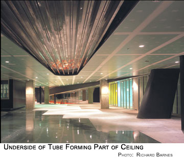
Koolhaas's solution was more symbolic and expensive. He rejected the idea
of using the building as a shield, preferring to muffle the noise of the
“L” by surrounding the tracks with a spectacular 530-foot elliptical
tube, faced in stainless steel, whose underbelly forms part of the Campus
Center's roof. The tube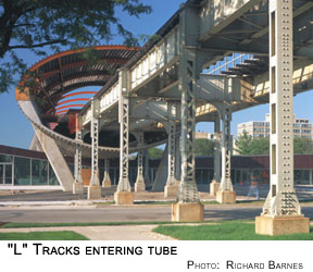 is isolated on a series of columns that reduce vibration by descending
62 feet to the bedrock. He told the competition judges, “We think
it can be done for something between a million and a half and two million,”
but the tube ultimately cost more than $13.6 million, paid largely out
of George Ryan's Illinois FIRST goody bag.
is isolated on a series of columns that reduce vibration by descending
62 feet to the bedrock. He told the competition judges, “We think
it can be done for something between a million and a half and two million,”
but the tube ultimately cost more than $13.6 million, paid largely out
of George Ryan's Illinois FIRST goody bag.
The Tube was completed last year, and inside the Campus Center the sound
of the “L” is barely audible, though north of the structure
the trains still drown out conversation. The Tube's slanting concrete
supports and flaming orange top serve as a symbol of the renewed campus-the
new IIT student Internet portal even calls itself “The Tube.”
As for the Campus Center itself, for Koolhaas
more is more, and a whole lot more is better still.
Much of the center's drama stems from the way he's packed an astounding variety of levels, ceiling heights, materials, and finishes into the single story. “People say the interior is going to feel like being inside
a pinball machine,” says architecture dean Donna Robertson. “But
18-year-olds really have a different way of engaging with the world than
you or I. They're used to responding to multiple layers of information,
and their response level is incredibly quick. They get this right away,
and they love it.”
Jeanne Gang, who
studied and worked with Koolhaas and whose firm is one of the project's contractors, says, “There's an interest in creating
the conditions that will bring chaotic activity-and finding that as a
joyous thing instead of trying to control and separate functions.”
“I think it's destined for architectural glory,” says undergrad
Robert Guico, who took an early tour. “I really noticed the change in elevation. When you walk in, there's bigger rooms that you actually look down into.”
The design of the roof derives from the metaphor of a violin, crushed
along its center by the Tube above it. It's a continuous concrete slab
that wraps over the 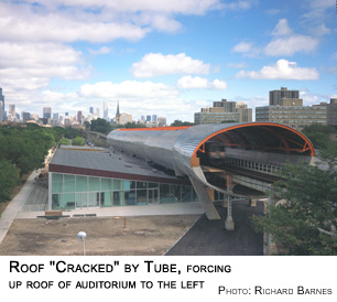 edges
of the building and slopes up to cover the higher ceilings of the ballroom
and auditoriums along State Street. “It's sprayed with a black synthetic
membrane that's overlaid with a burgundy of the same material,” says
Studio/Gang's
Mark Schendel, “and it results in a very beautiful wood-grain pattern.”
Yet it's already controversial, perhaps because the visible seams in the
membrane compromise the idea of wrapping the edge and the burgundy overlay edges
of the building and slopes up to cover the higher ceilings of the ballroom
and auditoriums along State Street. “It's sprayed with a black synthetic
membrane that's overlaid with a burgundy of the same material,” says
Studio/Gang's
Mark Schendel, “and it results in a very beautiful wood-grain pattern.”
Yet it's already controversial, perhaps because the visible seams in the
membrane compromise the idea of wrapping the edge and the burgundy overlay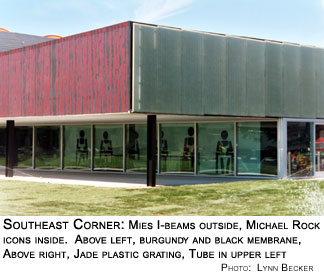 looks less like stained wood and more like the color of beer nuts.
The membrane is just one example of the explosive range of materials and
finishes at the center. Orange, the keynote color in the building's palette,
is a unifying theme. It's crucial to Koolhaas's concept of a wall of “Miesian
interference” that wraps around the facade and faces off against
Crown Hall. The black Mies used to paint his steel reflects the qualities
of his buildings -elegant, 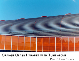 strong,
and protecting, but also mysterious and forbidding. Orange is seen almost
as its opposite - happy, warm, generous, and invigorating, but also overbearing
and superficial. strong,
and protecting, but also mysterious and forbidding. Orange is seen almost
as its opposite - happy, warm, generous, and invigorating, but also overbearing
and superficial.
Orange “straw glass” dominates the center's northwest corner.
“I'm waiting to see whether the pickets come out along State Street,”
Robertson had said before the wall went up, only half joking. The glass
covers the Welcome Center and the entrance, split into two vertical rows of panes, in places the topmost
extending above the roofline as a translucent parapet. During the day the space
directly inside the windows takes on a marmalade glow. Koolhaas says that
though the scale of the center is “very modest” compared to
Crown Hall, the orange of his building “somehow brings out the color in the Mies building also - not
only by contrast, but also by raising the issue of color. You suddenly see
much more color in Mies.”
Each panel of orange glass consists of two outer panes, between which
is a honeycomb wire mesh that during the day bends the outside light into
nimbuses of suns 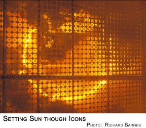 and
at night sends arcs of headlights coursing across the windows. The same
type of “tube core” glass, minus the orange tint, makes up the
entrance walls of interior offices. and
at night sends arcs of headlights coursing across the windows. The same
type of “tube core” glass, minus the orange tint, makes up the
entrance walls of interior offices.
South of the entrance the orange folds inside the building, moving onto
the high back wall of the auditoriums as a sunny zigzag made of a new DesignTex wall covering that's like a 3-D baseball card, creating the illusion of movement as you walk past it.
Green complements the orange. On the eastern facade the concrete walls
of the upper mechanical-services area are covered with a translucent pale
jade,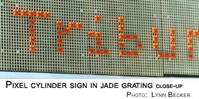 egg-crate-like plastic that conceals the ventilation system's massive
louvers yet allows air to flow freely. The sign over the east entrance
is made of orange-faced metal cylinders, mounted in holes of the grating,
that form the letters of the building's name.
egg-crate-like plastic that conceals the ventilation system's massive
louvers yet allows air to flow freely. The sign over the east entrance
is made of orange-faced metal cylinders, mounted in holes of the grating,
that form the letters of the building's name.
Inside,
the concrete columns that support the “L” tracks are left bare.
The large, slanting columns that support the tube are painted black, looking
a little like the smokestacks of a sleek ocean liner. Throughout, the
beautiful, slender versions of Mies's classic I-beam that support the
structure are left exposed, as is the single black beam that stretches
high up inside the windows along almost the entire length of the ballroom/auditorium
section on State.
Green epoxy covers the flooring of the sunken, Center Court sports bar,
as well as the adjacent grand staircase, which incorporates a wheelchair
ramp which rises at so gentle a slope that no railings are required. The
most beautiful surface, in an area earmarked for pool and Ping-Pong tables,
is an opalescent green the texture of the sea, polished to such a high
gloss that it seems almost liquid.
The floor is crisscrossed by aluminum walkways that mark the heavily traveled
pathways Koolhaas's team laid out in 1997. The standard carpet is a silver
and black stripe, and in many offices, a white wall faces off another
wall in 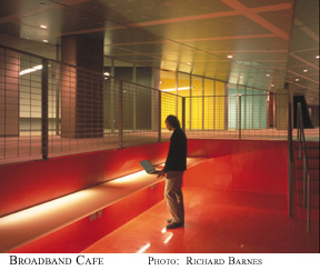 blackboard
finish, ready for chalking. The trench that forms the broadband cafe,
ramped to fit below the Tube, is surfaced in a deep maroon epoxy. blackboard
finish, ready for chalking. The trench that forms the broadband cafe,
ramped to fit below the Tube, is surfaced in a deep maroon epoxy.
Another
unifying theme is Koolhaas's use of Panelite,
a sheet of fiberglass or polyester resin with a honeycomb core that comes
in a variety of textures, colors, and transparencies and weighs about
half as much as plate glass. Koolhaas used shimmering gold and silver
"Sponge"
pattern Panelite for his New York Prada store. For the Campus Center he
chose translucent Panelite for the countertops in the cafe, for the tables
in the study carrels that overlook the Mies courtyard, and, most strikingly,
for the walls of the freestanding, amoeba-shaped washroom that sits just
inside the entrance, opaque enough, alas, to preclude any anatomical shadow
puppets.
In the middle of everything is a large glass “hanging garden”
that's open to the sky but completely sealed off from the rest of the
center. “The building,” says Schendel, “is amazing in the
sense that you can stand in it and look through to the outside, back to
the inside, back to the outside, back to the inside several times-like
a shish kebab of space.”
Koolhaas's engagement with Mies
is apparent the moment you walk in the door, because Mies is in
the door-an 18-foot-high portrait of him is sandwiched between the panes
of glass, so that you walk into the building through his head.
This kind of iconography plays a big part in Koolhaas's design, reflecting
Robert Venturi's conviction that in our electronic information age “architecture
should reject abstract form” of the Miesian variety and restore iconography
as the “essential architectural element.” As he explains, “Egyptian
hieroglyphics on pylons are like billboards; early Byzantine or Christian basilicas...have interiors teaming with signage-we call it high art....It was only in the twentieth century that they got rid of iconographic communication.”
Koolhaas asked New York graphic designer Michael
Rock to create imagery that, according to Donna Robertson, “comes
out of the Gothic tradition in  campus
architecture, where the gargoyles would carry jokes...comments on the
nature of academic life-the professor professing and students snoozing.
It reminds you that we are moving to being more image based than text
based.” Rock created a series of two-and-a-half-inch-round icons
- a “swirlies” icon to indicate washrooms didn't make the final
cut - that are used in multiple ways. On a white interior wall set just
inside the glass of the building's south facade, they're supersized to
form a single row that stretches floor to ceiling. Much smaller versions
are embedded along the surface of the stainless steel bulletin board,
scaled to where the round magnetic icons used to secure postings can rest
atop the shoulders of each iconic figure as a whimsical second head whose
only facial feature is the inscription "IIT." campus
architecture, where the gargoyles would carry jokes...comments on the
nature of academic life-the professor professing and students snoozing.
It reminds you that we are moving to being more image based than text
based.” Rock created a series of two-and-a-half-inch-round icons
- a “swirlies” icon to indicate washrooms didn't make the final
cut - that are used in multiple ways. On a white interior wall set just
inside the glass of the building's south facade, they're supersized to
form a single row that stretches floor to ceiling. Much smaller versions
are embedded along the surface of the stainless steel bulletin board,
scaled to where the round magnetic icons used to secure postings can rest
atop the shoulders of each iconic figure as a whimsical second head whose
only facial feature is the inscription "IIT."
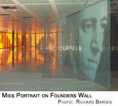
Most of the graphic images in the Campus Center are also made up of the
icons - they're like pixels in a sort of dot matrix pointillism. The Mies
in the entrance door is made up of them, and the massive “Founders
Wall” that dominates the building's welcome center consists of hundreds
upon hundreds of them. Step back, and the icons coalesce into seven nine-and-a-half-foot
portraits, including Mies again, Heald, Armour, Pritzker, and Galvin,
each “like a Chuck Close painting,” in the words of Mark Schendel.
Koolhaas sees the iconography as a response to globalization. “When
IIT opened you could probably assume that everyone would feel very welcome
in a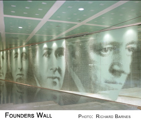 highly
abstract space such as Crown Hall,” he says. “I think that if
the current generation enters a building like that they feel a weird absence
of information. Given the fact that the student body is now literally from
at least four or five continents, it felt very important to try to develop
a language of fundamental information that is effective in these circumstances.” highly
abstract space such as Crown Hall,” he says. “I think that if
the current generation enters a building like that they feel a weird absence
of information. Given the fact that the student body is now literally from
at least four or five continents, it felt very important to try to develop
a language of fundamental information that is effective in these circumstances.”
Just outside the Center Court sports bar is a garden courtyard, the site
of a heated controversy that broke out in
March 2000, before construction began. When Koolhaas's design for the
building was first made public, preservationists were outraged at the
way it dealt with the neighboring Commons Building, the original student
center. Completed in 1953, it was the only major structure in the central zone along State between the campus and the dorms.
Depending on whose story you believe, its design either came directly
from the pencil of the master, or from associate Gene Summers, after Mies
threw up his hands on the project when the school failed to come through
with funding for 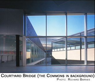 Mies's
more ambitious Student Union building. Whoever the designer was, the Commons
Building was another Miesian masterpiece -an exposed-frame, glass-walled
pavilion with an open interior that won an American Institute of Architects
award. Mies's
more ambitious Student Union building. Whoever the designer was, the Commons
Building was another Miesian masterpiece -an exposed-frame, glass-walled
pavilion with an open interior that won an American Institute of Architects
award.
By the time Koolhaas got to the building it had suffered decades of abuse.
The exterior walls had been punched through to add vents and pipes, and
its open interior was cluttered with makeshift partitions. His commitment
to restoring it got lost in the uproar over his decision to have his own
much larger building suck the Commons inside it like Jonah into the whale.
Two of its exterior walls would become walls within the Campus Center,
and the other two would become linear extensions the far larger building's
far longer walls.
John Vinci saw this as a direct attack on Mies's “simplicity and
purity,” declaring, “The only reason to do this is to clash
with Mies.” He wrote a letter to the Chicago Tribune charging Koolhaas
with “wanton defacement.” Architect Stanley
Tigerman backed Vinci, calling the new structure “a slap in the
face, a very ordinary building that does great damage to the Commons.”
Vinci proposed that Koolhaas move his building south, leaving the Commons clear on all four sides, and that he convert the Commons to a visitors' center and faculty club. Koolhaas bristled at the idea. “To make
the Commons into a Mies visitors' center," he told the Tribune, "would
be to embalm a structure that was intended by Mies to be used.”
“John Vinci's protest actually had a lot of effect,” says Donna
Robertson.“It galvanized the attention of the IHPA
[Illinois Historic Preservation Agency], which, because we accepted the
Tube money, had the right of review of anything we built, even if it wasn't
the Tube.”
The school brought in Gunny Harboe, an architect who specializes in restoration, to consult on new ways to handle the two buildings. Preservationists
won a temporary victory in May, when the IHPA staff asked that at least
12 feet separate the two buildings, but by July 2000 the staff had reversed
their decision. Robertson and IHPA associate director Bill Wheeler contended
a “valid compromise” was reached, but Vinci isn't buying, “I
don't think I made any progress. I lost.”
The Commons Building is being repaired and its original open interior
restored. A roof for the Campus Center loading dock that cantilevered
over the Commons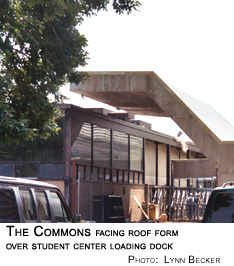 like a grasping claw was cut back. Robertson says that “superclear,
superwhite glass” was put in the eastern facade of Koolhaas's center
where it absorbs one side of the Commons to visually separate the two
buildings. The corner where the two meet is surrounded by the “Mies
courtyard,” the garden off the Center Court sports bar. Here the
foundation of the Commons has been dug out and clad in black painted steel.
like a grasping claw was cut back. Robertson says that “superclear,
superwhite glass” was put in the eastern facade of Koolhaas's center
where it absorbs one side of the Commons to visually separate the two
buildings. The corner where the two meet is surrounded by the “Mies
courtyard,” the garden off the Center Court sports bar. Here the
foundation of the Commons has been dug out and clad in black painted steel.
Mark Schendel says the Commons Building used to be “an orphan ...stranded
in a parking lot.” Now the courtyard offers a “magnificent view
of the Commons. I think you will see it in a completely new way.”
Nevertheless, exposing its foundation reduces the Commons to something
of an archaeological artifact.
Construction has been marked by a series
of “value-engineering” compromises intended to keep burgeoning
costs under control. That's not unusual for an innovative building, just
painful. Things wind up costing up more than anticipated; complications
ensue, economies are mandated. Part of the game of architecture is figuring
out how to make a great omelet even as they keep grabbing back back eggs.
“OMA built its practice on constraints,” says Schendel, and
Koolhaas has worked to keep his basic design intact even as he's been
forced to switch to less expensive materials.
Koolhaas had originally planned to use wood for the building's ceilings,
but that was a budget buster. Wood is costly, and it's flammable, so a second, 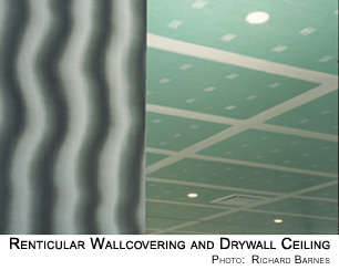 fireproof
ceiling would have had to be installed above it. In many places Koolhaas
turned to a solution he'd used before-the unpainted green drywall would
become the ceiling. The white plaster “mud” used to cover the
screw holes joints and seams between the boards - usually applied quickly
and without any concern about aesthetics, since it's just going to be
painted over - is here applied almost with an artist's care, resulting
in a ceiling that's a continuous expanse of large green rectangles framed
in white, each rectangle daubed with twin rows of small white squares.
“It's important to have these vast expanses of exposed Sheetrock,"
says Koolhaas, "because this is a kind of return of Miesian puritanism
about steel, but in a more abject material.” fireproof
ceiling would have had to be installed above it. In many places Koolhaas
turned to a solution he'd used before-the unpainted green drywall would
become the ceiling. The white plaster “mud” used to cover the
screw holes joints and seams between the boards - usually applied quickly
and without any concern about aesthetics, since it's just going to be
painted over - is here applied almost with an artist's care, resulting
in a ceiling that's a continuous expanse of large green rectangles framed
in white, each rectangle daubed with twin rows of small white squares.
“It's important to have these vast expanses of exposed Sheetrock,"
says Koolhaas, "because this is a kind of return of Miesian puritanism
about steel, but in a more abject material.”
Elsewhere rare zebrawood became fake zebrawood, then a zebrawood-like
wall covering. Travertine became epoxy flooring inside and grass outside. Koolhaas has visited the site about twice a year. On one trip he was so unhappy that work was temporarily stopped. But when he returned at the beginning of July he was said to be excited by the progress.
Work on the building is going right down to the wire. Just last week longtime
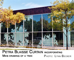 Koolhaas
collaborator and companion, Dutch interior and landscape designer Petra
Blaisse, could be seen in the auditorium supervising the hanging of
her 30-foot-high draperies, incorporating a Mies drawing of a tree, black
on white on the inside, white on black on the reverse. As dedication day
looms ever closer, questions about whether everything will be finished
in time are met with an almost mantra-like response: “It has
to be finished.” Koolhaas
collaborator and companion, Dutch interior and landscape designer Petra
Blaisse, could be seen in the auditorium supervising the hanging of
her 30-foot-high draperies, incorporating a Mies drawing of a tree, black
on white on the inside, white on black on the reverse. As dedication day
looms ever closer, questions about whether everything will be finished
in time are met with an almost mantra-like response: “It has
to be finished.”
Unlike Crown Hall, where you can imagine yourself, like Mies, sitting
alone atop that stack of plywood, and still having a wonderful experience
of the space, Koolhaas's Campus Center feels incomplete without the bustle
of the people it's designed to serve. It's as much a dynamic as it is
an object, and people will have to fill it before we'll know whether their
rubbing together will produce the sparks Koolhaas intended. What can't
be denied, however, is that the marriage of a group of users overwhelmingly
young, bright and receptive with a sympathetic client, determined to get
noticed, has both inspired Koolhaas and given him the opportunity to create
a building that's a dazzling showplace for his ideas.
At the moment Koolhaas is working on one other big U.S. project, the new Seattle public library, scheduled to open next year, and he's just won
a commission to build an 800-seat theater in Dallas. But like many architects,
he's hit a dry streak, and OMA's response has sometimes turned bitter.
Earlier this year his partner Ole Scheeren told the London Independent
that OMA had made a conscious decision not to join the competition for
rebuilding Ground Zero in New York. He explained that competing would
have meant choosing to “associate with . . . [a] nation that is at
the end of its greatness and propelling war plans into the world.”
In his essay, “Delirious
No More,” in the June issue of Wired, Koolhaas labeled Daniel
Libeskind's plan for Ground Zero “a massive representation of hurt
that projects only the overbearing self-pity of the powerful” and
“captures the stumped fundamentalism of the superpower. Call it closure.”
China seems to be the new focus of Koolhaas's enthusiasm. “Two billion people won't be wrong,” he wrote in Great Leap Forward. Scheeren
told the Independent, “It's the choice to associate yourself with
a regime that is on the brink of opening up and propelling itself into
a positive-thinking world.”
Koolhaas has been picked to design a new $600
million headquarters for CCTV, China's state television monopoly. At 700 feet, it will be the tallest
building in Beijing. China, with its booming economy and centralized control,
can still allow an architect to dream on a grand scale.
Of course the China that has allowed the remarkable economic growth of
the Pearl River Delta is the same China that privatized an effective public-health
system and left one billion peasants without access to adequate care,
the same China where this summer 350,000 people in Hong Kong protested
provisions of the proposed Article 23 so repressive they'd make John Ashcroft
salivate. Yet China is letting Koolhaas build, and for that he seems willing
to look the other way.
Asked if he thinks it's still possible to do good work in America, Koolhaas
says, “We're working in the United States, and IIT is one example, but
also we're doing the library in Seattle . . . it is really astonishing.
An architect isn't going to decide where he works. We had a phenomenally
strong project
for LACMA [the Los Angeles County Museum of Art; in a project valued
at $400 million] that went into the garbage dump and a phenomenally strong
project for the Whitney [Museum, for an estimated $200 million] that went
into the garbage dump. We wanted desperately to participate in a project
for the United Nations, but we were not invited.”
He decries the “fragility of cultural institutions in a country where
culture is financed by [private] gifts rather than by [state] subsidies,”
as it is in much of the rest of the world. But he insists he's here to
stay. "We have an office in New York that is open for business."
When
architects describe how they create their buildings, they
talk about logic and objectivity, but the more subjective element of personality
plays a stronger role than many would care to admit. How architects see
the world and how they respond to the values of their time can mark their
buildings as distinctively as fingerprints.
Mies would study a client's needs intensely and create reams of preliminary drawings, yet no matter what problem a project posed, the answer always wound up being a variation of the classic Miesian glass box. Koolhaas
also prides himself on doing intense research for each project, yet the results
always bear a highly individualistic stamp that can't be mistaken for
the work of any other architect.
For a bad architect, indulging personality is like giving a child a box
of matches and telling them to go out and play, but for the great ones,
personality is not a weakness, but a strength. It is their personality
that crystallizes the spirit of the time in their work, and drives them
to imagine themselves as creators of alternative new worlds that transcend
the annihilating failures of their era.
“Architecture
is an historical process,” says Mies. “It belongs to the epoch.” As one epoch fades into the next, values evolve. Mies, a
child of his time, believed above all in truth and in order, and he didn't see
order as an oppressive force. “The real order,” he said, “is
what Saint Augustine
said about the disposition of equal and unequal things according to their nature.” In his work this meant eliminating the things he didn't
think fit: curving walls, triangular facades, rounded roofs, oval rooms, diagonal corridors, bright colors, but the result was buildings of astonishing
clarity and grace, and a transparency offering an almost existential emptiness.
In our own time, when order is shunned as control and truth is often declared suspect, Koolhaas has other priorities. “I believe in uncertainty,”
he says in S,M,L,XL, and his Campus Center embraces the very architectural
elements Mies rejected. Yet he's also acutely aware of the downside of
our era's values. His 2001 essay Junkspace creates a harrowing
portrait of unchecked market forces expanding the world's capacity to
pump out ever larger quantities of just about everything, including architecture,
even as that architecture becomes relentlessly more generic. Koolhaas
responds with buildings that are as far from generic as you're likely
to get, all but bursting with ideas and intimations of better worlds.
Mies is about reduction and subtraction, Koolhaas about addition and multiplication. A Mies building is like a Bach cantata, perfect and crystalline.
A Koolhaas building is like a Mahler symphony, an attempt to capture the
complexity of the world in a single work.
It's important to remember that the “simpler” time in which
Mies built the IIT campus was a time when the world was engulfed in unspeakable violence. Mies tried to make an architecture that was both an answer and an alternative.
And that's the point where he and Koolhaas connect, though the link is
sometimes obscured by Koolhaas the writer's despairing depictions of our
time. Koolhaas the architect still allows for hope. “Behind every
project we do there is a kind of vast critical apparatus of doing better,” he says. “We're
not trying to emulate the current mess. We are just as interested in the
sublime.”
••••••
 Intro
| Mies | Koolhaas
|
| Campus Center | Koolhaas
Interview
Intro
| Mies | Koolhaas
|
| Campus Center | Koolhaas
Interview 
lynnbecker@lynnbecker.com
© Copyright
2003-2004 Lynn Becker All
rights reserved.
|

 Oedipus
Rem - continued
Oedipus
Rem - continued